Blog Details
Home Blog Details

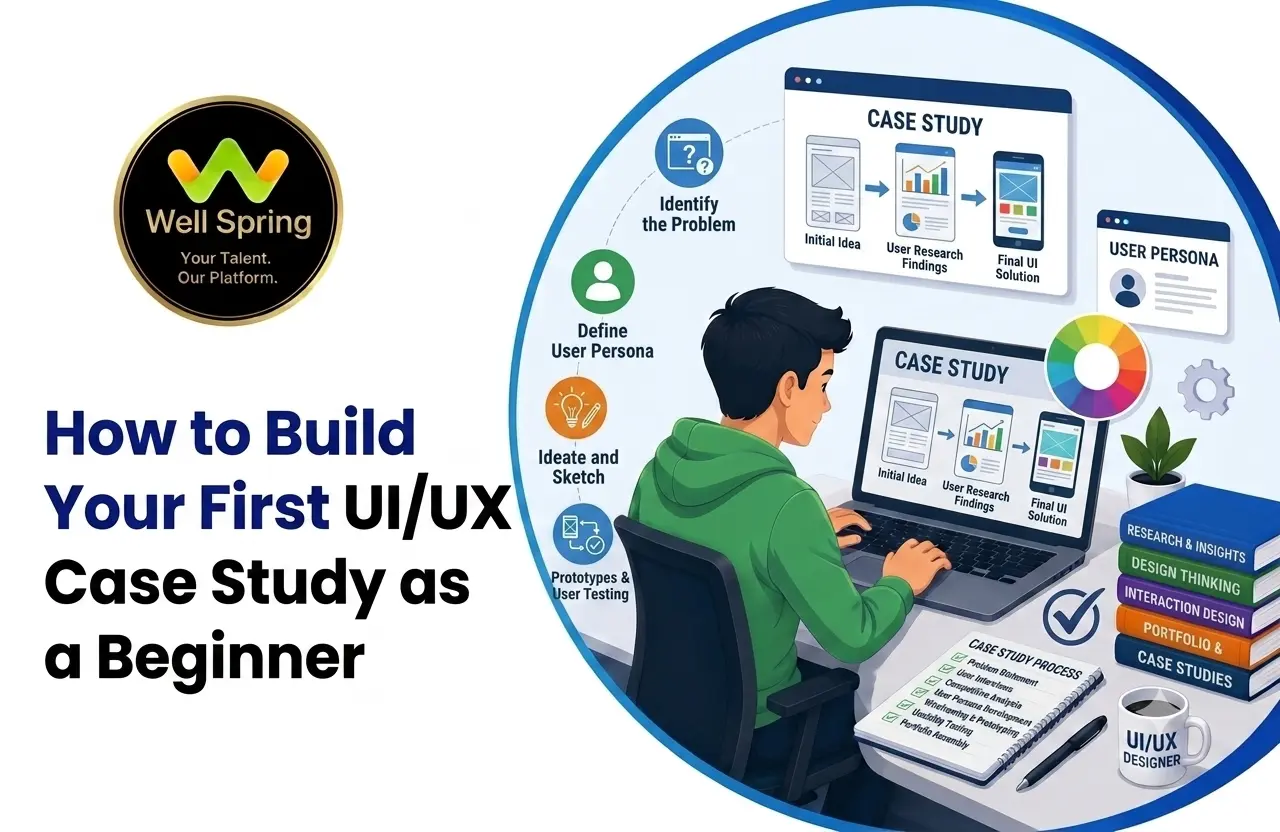
Your first UI/UX case study does not need a famous client, complex application, or impressive business metrics. It needs to show how you approached a problem, what you discovered, why you made certain design decisions, and how you improved the solution.
This guide explains how beginners can turn a small UI/UX project into a credible portfolio case study, including research, wireframing, UI design, prototyping, usability testing, documentation, presentation, and common mistakes to avoid.
Start with a specific user problem, not a collection of screens.
Then:
The most important principle is simple:
A UI/UX case study should explain why the design evolved, not merely show what the final design looks like.
Your first UI/UX project often starts with enthusiasm.
You find a problem, open Figma, create a few wireframes, choose colours, build polished screens, and eventually have something that looks like a finished product.
Then you try to turn it into a portfolio project.
That's where many beginners get stuck.
They know what they designed, but they don't know how to explain why they designed it.
A portfolio reviewer, however, is rarely interested only in whether you can create attractive screens. They also want to understand how you approach a problem, what your role was, what decisions you made, and how you responded when your initial idea needed to change.
That is what makes a UI/UX case study valuable.
It transforms a project from:
“Here are the screens I created.”
into:
“Here was the problem, this is what I discovered, these were the decisions I made, this is what I tested, and this is how the solution evolved.”
For a beginner, that distinction can make a significant difference.
Your first case study does not need to prove that you are an experienced product designer.
It should demonstrate that you can approach a design problem thoughtfully.
A reviewer should be able to find evidence of several capabilities:
This is why a simple project can work surprisingly well.
Imagine two portfolios.
A visually impressive food-delivery app with 35 screens, elaborate animations, and almost no explanation of why the interface was designed that way.
A smaller student registration experience with 10 carefully selected screens, a clear problem, five user interviews, two explored navigation concepts, usability testing, and documented changes.
Portfolio B may provide more useful evidence about the designer's thinking.
The lesson is:
Complexity of the product is not the same as quality of the case study.
The first decision may be the most important one.
Beginners often choose projects because they sound impressive:
These ideas can quickly become too broad.
Instead, look for a problem with a defined beginning and end.
For example:
“Improve online education.”
“Help college students compare short-term technical courses before registering.”
The second problem gives you a specific journey to investigate.
You can examine:
A useful rule for your first project is:
Pick the smallest problem that still gives you enough decisions to demonstrate your skills.
Your project's context affects how you should present it.
You identify a problem yourself and create a solution.
The project originated from coursework or an assignment.
You created it while learning UI/UX through structured training.
You analyse an existing product and propose improvements.
You worked with an actual organisation or client.
You contributed to a project in a professional environment.
There is nothing wrong with a self-initiated case study.
The mistake is pretending it was something else.
If you redesigned a popular app independently, write:
Do not write:
unless the company actually commissioned your work.
Being transparent about project context makes your portfolio more credible.
A weak problem statement sounds like:
“The existing website has a poor user experience.”
A stronger one explains the user, task, barrier, and consequence.
For example:
First-year students struggle to find suitable technical workshops because event information is distributed across multiple communication channels, making it difficult to compare dates, eligibility, and registration requirements.
Now you have something you can investigate.
You can ask:
The problem statement should act as a boundary for the project, not as a decorative paragraph at the beginning of your portfolio.
A beginner UX portfolio often contains elaborate personas that look professional but contribute very little.
You don't necessarily need:
Start with the characteristics that matter to the problem.
For example:
Primary user: First-year college students who want to discover skill-development workshops but are unfamiliar with the institution's registration process.
Then describe relevant characteristics:
The test is simple:
Does this user definition help you make a design decision?
If not, simplify it.
One of the easiest beginner mistakes is collecting UX artifacts because they are expected in a case study.
You create:
and then struggle to explain how any of them influenced the design.
A better approach starts with questions.
Suppose you're designing a course-discovery experience.
You might need to know:
Those questions determine your research approach.
Depending on the project, you could use:
You don't need every method.
You need the methods that help you make better decisions.
A beginner project may involve only a handful of participants.
That's fine if you describe the evidence accurately.
For example:
“I conducted six exploratory interviews with college students to understand how they currently discover and compare workshops. The sample was small and intended to identify recurring usability concerns rather than represent the wider student population.”
That is stronger than:
“Research showed that all students prefer…”
Your claim should never be bigger than your evidence.
This is an important E-E-A-T principle for portfolio writing:
Strong credibility does not come from making impressive claims. It comes from making accurate claims.
Research becomes valuable when it changes what you do.
Suppose your research produces three observations:
You could translate these into design priorities:
|
Finding |
Design implication |
|
Dates are frequently compared |
Make dates highly scannable |
|
Eligibility is often missed |
Place eligibility near the decision point |
|
Confirmation is unclear |
Create a stronger completion state |
Now the relationship is visible:
Finding → Design implication
This is more useful than adding several pages of raw interview notes.
When documenting your case study, show the connection.
For example:
Finding: Users checked dates before reading descriptions.
Design response: Date and availability were moved into the primary information hierarchy.
That sentence tells a story.
Imagine a participant says:
“It would be nice if this had reminders.”
A beginner might immediately add a reminder feature.
But first ask:
Perhaps they are worried that they will forget the event.
Or perhaps they are not confident that registration succeeded.
Those are different problems.
The reminder is only one possible solution.
This distinction matters:
User feedback is input. It is not automatically a product requirement.
Good UX work interprets feedback rather than converting every comment directly into a feature.
Before designing the new experience, understand the current one.
For a workshop registration problem, the current journey might look like:
See announcement → Open message → Find link → Read details → Search for registration form → Submit → Wait for confirmation
Now ask:
This creates a baseline for the redesign.
You can then explain not simply:
“I made the experience simpler.”
but:
“The original journey required users to move between an announcement, a separate information page, and a registration form. The redesign brought the decision-critical information into one flow.”
That is much more defensible.
Your first design idea is not necessarily your best idea.
Suppose users need to find a suitable workshop.
You could explore:
Useful when users already know what topic they want.
Useful when users are exploring unfamiliar options.
Useful when users need help discovering relevant options.
You don't have to fully design all three.
Even a few early sketches can help you compare them.
Then explain why you selected one.
For example:
“Because most participants already knew the subject they wanted to learn, I prioritised search and filtering rather than making recommendations the primary entry point.”
That one decision tells the reviewer more than a page filled with unexplained wireframes.
Wireframes are useful because they let you solve structural problems before spending time on visual polish.
Focus on:
At this stage, ask:
What needs to appear first?
rather than:
What colour should this button be?
A practical progression might be:
Sketch → Low-fidelity wireframe → Refined structure → High-fidelity UI
If your wireframe changes significantly after reviewing the flow, that's useful information.
Document the change.
Once the structure is working, move into visual design.
Your UI design portfolio should make your visual skills easy to assess, but visual quality should support the underlying experience.
Consider:
Does the hierarchy help users scan the page?
Does colour communicate hierarchy, status, or action?
Does spacing make relationships between elements obvious?
Are repeated patterns consistent?
Is the primary action clear?
What happens when the user encounters an error, empty state, loading state, or success state?
A polished interface is valuable.
But polish without reasoning provides limited evidence of UX ability.
Many beginner portfolios show only ideal scenarios.
Real interfaces rarely work that way.
Suppose you design a registration experience.
You may need:
You don't necessarily need to show every state in the main case study.
But thinking through them demonstrates that you understand the interface as a system rather than a sequence of attractive screenshots.
You don't need to prototype every interaction.
Choose the journey that carries the most risk or uncertainty.
For example:
Find workshop → Compare options → View details → Register → Confirm
This gives you something concrete to test.
A prototype becomes much more useful when it answers a question such as:
“Can a first-time user identify an appropriate workshop and understand how to register without additional explanation?”
Now the prototype has a purpose.
Avoid testing with:
“Have a look around and tell me what you think.”
Instead, create a scenario.
For example:
“You are a first-year student looking for a beginner-friendly Python workshop next Saturday. Find an appropriate session and register for it.”
Then observe.
Pay attention to:
You are not trying to prove that your design is perfect.
You are trying to discover where your assumptions are wrong.
Your case study should answer:
For example:
Eligibility appeared below the course description.
Three participants selected courses without noticing the eligibility requirement.
Eligibility was moved into the primary information block near the registration action.
The information became visible at the moment users were deciding whether to continue.
That is strong case-study material because the relationship between evidence and design is obvious.
A portfolio does not need to present a flawless design journey.
A useful failed approach can demonstrate maturity.
For example:
“I initially used icon-only navigation to reduce header density. During testing, participants interpreted two icons differently, so I replaced them with labelled navigation. The revised version used slightly more space but improved discoverability.”
This communicates:
That's far more informative than simply saying:
“I created intuitive navigation.”
Separate Your Design Outcome From Business Results
This is particularly important for self-initiated projects.
If you did not launch the product, don't invent conversion rates.
Instead of:
“The redesign increased registrations by 28%.”
say:
“The redesigned prototype reduced the registration journey from six steps to four.”
Or:
“In exploratory usability testing, four of five participants completed the task without assistance.”
Those are claims you can actually support.
If the project is conceptual, say so.
A limitation honestly explained is better than a fabricated success metric.
Once the project is complete, don't simply upload your process in chronological order.
Edit it into a story.
A strong structure is:
What was difficult and for whom?
Why was the problem worth solving?
What did you investigate?
What did you learn?
What did those findings change?
What alternatives did you consider?
How did the structure evolve?
What did you design?
What happened when people used it?
What changed?
What can you confidently claim?
What would you explore next?
This provides enough structure without turning the case study into an archive of every artifact you created.
A good case study is selective.
Ask of every artifact:
If not, it may not need to be there.
When reviewing UX case study examples, don't focus only on how attractive the page looks.
Study the reasoning.
Look for:
Then ask:
What did the designer prove through this case study?
For example, one case study might demonstrate research ability.
Another might demonstrate information architecture.
Another might show interaction design.
Another might be particularly strong visually.
You don't need to copy their format.
You need to understand what makes their work convincing.
When reviewing UI UX portfolio examples, compare them based on what they make easy to understand.
|
Portfolio element |
What to evaluate |
|
Homepage |
Can you understand the designer's focus quickly? |
|
Project selection |
Are the projects meaningfully different? |
|
Case studies |
Can you follow the reasoning? |
|
Visuals |
Are important screens easy to inspect? |
|
Writing |
Is the explanation concise? |
|
Navigation |
Can you move through the portfolio easily? |
|
Evidence |
Are claims supported? |
|
Role |
Is the designer's contribution clear? |
A portfolio is itself a user experience.
If the reviewer has to hunt for your role, project outcome, or final designs, the portfolio is creating unnecessary friction.
A single strong case study can support several types of portfolio content.
Your UX presentation might highlight:
Problem → Research → Insight → Flow → Testing
Your UI presentation might highlight:
Visual direction → Typography → Components → Screens → States
Your interview presentation might highlight:
Challenge → Decision → Trade-off → Outcome → Learning
This is useful because you don't have to create a completely separate project for every portfolio purpose.
The same project can demonstrate different skills depending on how you frame it.
A UI UX project presentation should be considerably shorter than the complete written case study.
A slide structure can work well:
Don't fill every slide with paragraphs.
Use visuals to carry information wherever possible.
A huge scope usually produces shallow reasoning.
Better: Narrow the problem.
Beautiful screens can distract you from a poorly defined problem.
Better: Establish the user problem first.
Research without a design consequence adds little value.
Better: Explain what each important finding changed.
More artifacts can make the story harder to follow.
Better: Curate.
Unsupported claims damage credibility.
Better: Label assumptions and limitations.
Perfect processes look unrealistic.
Better: Show meaningful revisions.
A case study should demonstrate understanding, not vocabulary.
Better: Explain specialised terms when necessary and write in plain language.
A prototype cannot prove production revenue or conversion results.
Better: Report what you actually measured.
Real users encounter errors and unusual situations.
Better: Consider relevant edge cases.
What user problem are you addressing?
Why does the problem matter?
How did you investigate it?
What did you learn?
How did the findings influence your approach?
What alternatives did you consider?
How did the structure evolve?
What visual and interaction decisions did you make?
What important journey did you model?
What did participants do?
What changed as a result?
What can you confidently claim?
What could you not validate?
What would you investigate or improve next?
Portfolio guidance from Nielsen Norman Group has repeatedly emphasised that UX portfolios should communicate the problem, designer's role, constraints, process, iterations, and relationship between research and design, rather than functioning solely as collections of final screens.
That is particularly relevant to beginners because a portfolio cannot rely on years of professional experience to establish credibility. The case study itself has to make the designer's contribution and reasoning understandable.
Interaction Design Foundation guidance similarly recommends treating a UX case study as a story that communicates the project journey, decisions, iterations, outcomes, and lessons learned rather than simply displaying artifacts.
The practical implication is important:
You do not make a case study stronger by documenting more activity. You make it stronger by documenting the activity that explains your decisions.
For a beginner, that distinction can dramatically improve both portfolio quality and interview conversations.
One of the most common mistakes in beginner portfolios is trying too hard to look experienced.
That can lead to:
You don't need any of that.
If your project is self-initiated, say so.
If your research involved six people, say so.
If you couldn't test a particular feature, explain that.
If the project is conceptual, identify it as conceptual.
A recruiter does not need you to have solved a global product problem.
They need enough evidence to understand how you currently approach design.
Accuracy is part of professionalism.
Before publishing, make sure a reviewer can answer these questions quickly:
What was the problem?
If this isn't obvious, your case study needs a clearer opening.
What did you actually do?
Your role should be explicit.
Why did you make the important decisions?
This is where evidence and reasoning matter.
What changed?
Show iteration rather than only the final result.
What did you learn?
Reflection demonstrates that the project was more than a visual exercise.
If your case study answers those questions clearly, you already have a solid foundation.
Project
Problem
Research
Design
Testing
Presentation
Credibility
Your first UI/UX case study does not need to look like the portfolio of someone with ten years of experience.
It needs to make your thinking visible.
Start with a problem that is small enough to investigate properly. Understand who experiences it. Research the parts of the experience you don't yet understand. Turn those findings into design priorities. Explore alternatives before committing to one direction.
Then build the interface.
Prototype the important journey.
Test it with realistic tasks.
When something doesn't work, change it—and document why.
Most importantly, don't manufacture credibility.
A self-initiated project can be valuable without pretending to be client work. A small research sample can still be useful without being presented as statistically representative. A prototype can demonstrate design improvement without claiming production business results.
Your portfolio should make one thing clear:
You can identify a problem, think through it, make deliberate design decisions, learn from evidence, and communicate what you learned.
That is a strong foundation for a UI/UX career.
If you can follow Figma tutorials and create individual screens but still struggle to turn those screens into a complete case study, the missing piece may not be another software tutorial.
You need guided practice connecting the parts:
Learn → Practise → Build → Get Feedback → Test → Improve → Present
That is where structured, project-based learning becomes useful.
Well Spring Talent Solutions focuses on practical, industry-oriented learning with project exposure, internships, mentoring, and career preparation. For an aspiring UI/UX designer, the value is in getting opportunities to move beyond isolated exercises and work through the complete process of creating and presenting meaningful projects.
If your next goal is to build a portfolio that can support internship or entry-level applications, start by turning one well-defined problem into one well-documented case study.
You don't need ten projects to begin.
You need one project that gives you something real to explain.
21 Oct 2026
21 Oct 2026

20 Oct 2026
20 Oct 2026

19 Oct 2026
Choose a manageable user problem, research the existing experience, identify useful findings, explore solutions, design and prototype the experience, test it, document important iterations, and present the final work as a clear story of decisions.
Yes. Self-initiated, academic, course, volunteer, and redesign projects can all be used. Be transparent about the project's context.
A strong UX portfolio case study generally includes the problem, user context, relevant research, findings, design decisions, exploration, final solution, testing, iterations, outcomes, and reflection.
Quality matters more than simply increasing the number. A few projects that demonstrate different skills can be more useful than many similar exercises.
No. Include wireframes that demonstrate meaningful structural decisions or changes. Remove versions that do not add anything to the story.
Conduct the research you can realistically perform and be transparent about its limitations. You can also use appropriate secondary research or heuristic evaluation when direct user access is unavailable.
Yes. A redesign can demonstrate problem analysis and design thinking. However, avoid claiming knowledge of the original company's users, analytics, or business goals unless you actually have that information.
A UI design portfolio should make visual hierarchy, typography, layout, components, colour, consistency, interaction states, and interface quality easy to evaluate. It should also provide enough context to explain important visual decisions.
Look for examples where you can clearly see the problem, research, decision-making, iteration, and outcome. Study the reasoning rather than copying the visual style or structure.
Look at how quickly you can understand the designer's role, project problem, process, final work, and outcome. A strong portfolio should make relevant evidence easy to find.
It is a condensed version of a project designed for interviews, reviews, or presentations. It should focus on the problem, evidence, important decisions, solution, testing, and learning rather than showing every project artifact.
You need enough interface-design knowledge to create and communicate the solution, but the quality of the case study depends on more than tool proficiency. Problem framing, UX reasoning, testing, and communication are equally important.
It should be sufficiently detailed to explain important decisions, but unnecessary length can make it harder to understand. Include evidence that moves the story forward rather than documenting every step.
Yes. A rejected approach can be valuable when it explains what you learned or why the final direction changed. Choose meaningful failures rather than displaying every discarded experiment.
We provide IT training, internships, and online learning for students in Trichy and across India.
We also welcome enquiries from students in these neighbourhoods, towns, and surrounding locations.
Can't attend classes in person? Explore online IT training opportunities with Well Spring Talent Solutions, designed to help learners develop practical technology skills from different locations across India.
Get internship updates, IT training news, placement opportunities, and career tips directly to your inbox.
Join our WhatsApp community for internship updates, IT courses, placement support, and latest job opportunities.
Join Now