Blog Details
Home Blog Details

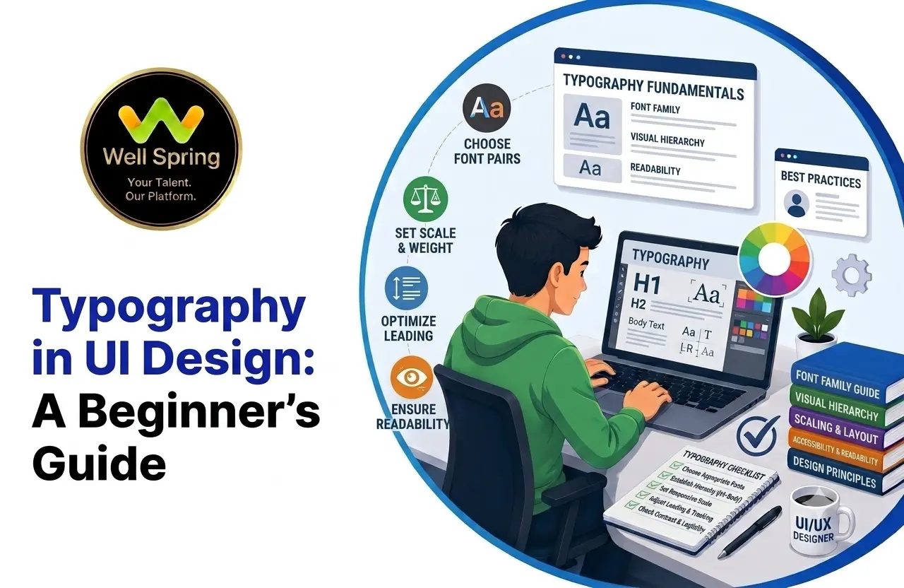
Typography in UI design is more than choosing attractive fonts. It affects readability, visual hierarchy, usability, accessibility, and the overall experience of a digital product.
For beginners, understanding typography principles can make interfaces look more professional and easier to use. By learning how to choose typefaces, control font size and weight, manage spacing, create hierarchy, and design for different screen sizes, you can create clearer and more effective user interfaces.
This guide explains the fundamentals of UI typography and provides practical rules and examples beginners can apply to their own designs.
Typography in UI design is the practice of selecting and arranging text so that users can read, understand, and navigate an interface easily.
Good UI typography considers:
The goal is not simply to make text look good. The goal is to make information easier to understand and interact with.
When people think about UI design, they often focus on colors, images, buttons, layouts, and icons. However, text is one of the most important elements in almost every digital interface.
Users read navigation labels, headings, descriptions, form instructions, product information, notifications, error messages, and buttons. If the typography is difficult to read or poorly organized, even a visually attractive interface can become frustrating to use.
This is why typography in UI design deserves careful attention.
Good typography helps users understand what they are seeing, identify important information, scan content quickly, and complete actions with less effort.
For beginners, typography can initially seem complicated because there are many variables to consider. However, you do not need to become a typography expert to create effective interfaces. You need to understand a few core principles and apply them consistently.
Typography in UI design refers to the way text is selected, styled, arranged, and presented within a digital interface.
It includes decisions such as:
Typography connects visual design with usability.
A heading that is larger and heavier than supporting text immediately communicates importance. Similarly, well-spaced body text makes longer content easier to read.
Typography therefore acts as both a visual and functional design tool.
Choosing a font is only one part of UI typography.
A designer must also determine how that font behaves throughout the interface. The same typeface can look excellent in one design and ineffective in another depending on its size, spacing, weight, and placement.
For example, a font may look attractive in a large heading but become difficult to read when used for small body text.
Good typography considers the complete text system rather than treating each text element as an isolated design decision.
Typography hierarchy helps users understand the importance and relationship of different pieces of content.
A typical interface might contain:
These elements should not all have the same visual appearance.
For example:
Page Title
Large and prominent
Section Heading
Medium-sized and visually distinct
Body Text
Comfortable size with good line height
Supporting Text
Smaller but still readable
This creates a visual structure that users can scan quickly.
Readability
Readability describes how easily users can read and understand text.
Several factors influence readability, including:
A beautiful typeface is not useful if users struggle to read it.
For UI design, prioritize clarity over decoration.
A typeface contributes to the personality of an interface.
For example, different typefaces can communicate different visual qualities such as:
However, personality should not come at the expense of usability.
When selecting a typeface for an interface, consider:
For beginners, a simple and highly readable typeface is often a better choice than an overly decorative one.
A common beginner question is whether a UI should use one typeface or multiple typefaces.
In many interfaces, using a single typeface with different weights and sizes is enough.
For example:
This creates consistency without making the interface visually complicated.
Using two complementary typefaces can also work. One may be used for headings and another for body content.
However, adding more fonts does not automatically make a design better.
A useful beginner rule is:
Start with one typeface. Add another only when it serves a clear design purpose.
Typography works as a system. Font size, weight, line height, and letter spacing should be considered together.
Font size affects hierarchy and readability.
Larger sizes can be used for:
Smaller sizes can be used for:
Avoid making body text unnecessarily small just to fit more content onto a screen.
Font weight helps create emphasis.
For example:
Too many weights can make an interface feel inconsistent.
Choose a small set of weights and use them intentionally.
Line height controls the vertical space between lines of text.
If line height is too small, paragraphs can feel crowded.
If it is too large, the relationship between lines can become difficult to follow.
Comfortable line height is particularly important for:
Letter spacing controls the horizontal space between characters.
Small adjustments can improve the appearance of:
However, excessive letter spacing can reduce readability.
Use it carefully rather than applying the same spacing to every text element.
A type hierarchy gives users a predictable way to understand content.
A simple system could include:
|
Text Type |
Purpose |
|
Page Title |
Identifies the main page |
|
Section Heading |
Separates major content areas |
|
Subheading |
Introduces supporting sections |
|
Body Text |
Provides detailed information |
|
Label |
Identifies controls or fields |
|
Caption |
Provides secondary information |
|
Button Text |
Communicates an action |
The exact sizes depend on the design system, platform, and product.
What matters most is that the relationship between the styles is clear and consistent.
One of the best ways to evaluate typography is to use realistic content instead of placeholder text.
A typography system may look good with a short sample sentence but behave differently when users encounter:
Try testing your typography with at least three types of content:
Short content
A short heading or button label.
Medium content
A typical paragraph or card description.
Long content
A longer article, instruction, or detailed description.
If the typography works across all three, your system is more likely to work in the real product.
Do not design only around perfect placeholder text.
Real content can be longer, shorter, or structurally different from what you initially expect.
Test your design with realistic content before finalizing the typography.
If one page uses a particular heading style, similar headings elsewhere should follow the same pattern.
Consistency reduces cognitive effort and makes interfaces easier to learn.
Using many typefaces, weights, sizes, and decorative effects can make a UI look chaotic.
Create a limited type system and reuse it.
Typography should help users understand information quickly.
If a design choice makes text harder to read, reconsider whether the visual effect is worth it.
Headings should be visually different from body text.
Labels should be distinguishable from their associated values.
Primary actions should be easy to identify.
Hierarchy does not always require dramatic differences. Small, consistent changes can be enough.
Left-aligned text is often easier to scan in interfaces containing paragraphs and lists.
Centered text can work well for short headings, hero sections, or specific promotional layouts.
Choose alignment based on the content and user task.
Typography behaves differently depending on the interface component.
Navigation
Navigation text should be:
Avoid using decorative typography that makes navigation difficult to understand.
Buttons
Button text should clearly communicate the action.
Examples include:
Keep button labels concise and make sure the text is visually distinct from surrounding content.
Forms
Forms require particularly clear typography.
Use typography to distinguish:
Users should be able to understand what information each field requires without confusion.
Cards
Cards often contain several levels of information.
For example:
Course Title
Short description
Duration and other supporting information
View Course
A clear type hierarchy helps users scan the card quickly.
Dashboards
Dashboards may contain:
Typography should help users identify the most important information first.
Large numbers can communicate key metrics, while smaller labels provide context.
Responsive Typography
Typography should work across different screen sizes.
A heading that looks balanced on a desktop screen may become too large on a mobile device.
Similarly, body text that appears comfortable on a desktop may become difficult to read if it is reduced too aggressively on mobile.
When designing responsive typography, consider:
Do not simply shrink every text element proportionally.
Instead, review the hierarchy and readability of the complete interface at each breakpoint.
Accessible typography helps more users read and understand an interface.
Important considerations include:
Accessibility should be considered during the design process rather than added at the end.
For example, an error message should not rely only on red text to communicate that something went wrong. A clear message, icon, or other supporting indicator can make the information easier to understand.
Similarly, low-contrast text may look subtle and stylish but can become difficult for users to read.
A strong UI typography system balances visual style with accessibility.
Understand the Content
Before choosing typography, understand what users need to read.
Identify:
This helps you understand the hierarchy the interface needs.
Choose the Typeface
Select a typeface that fits the product while remaining readable.
Start with one reliable typeface if you are unsure.
Establish the Type Scale
Define a limited range of sizes for different content levels.
For example:
The exact values can change depending on the project.
Define Font Weights
Choose only the weights you actually need.
For example:
Avoid creating unnecessary variations.
Set Line Height
Test paragraphs, headings, lists, and interface labels.
Adjust line height according to the content rather than applying one value blindly.
Check Spacing
Review the space between:
Typography does not exist separately from layout.
Test Responsive Behavior
Review the typography on:
Check whether headings wrap naturally and whether body text remains comfortable to read.
Test Accessibility
Check contrast, readability, resizing, and spacing.
Make sure important information does not depend solely on font size, color, or weight.
Imagine a course website with the following original design:
Before
The interface may contain all the necessary information, but users have difficulty scanning it.
Now improve the typography:
After
The content itself has not changed. The typography has simply made the information easier to understand.
This demonstrates an important UI design principle:
Good typography improves the way users experience existing content.
A font may look beautiful but perform poorly in an interface.
Always test it with real UI content.
Multiple fonts can quickly create visual inconsistency.
Start simple and introduce additional typefaces only when necessary.
Trying to fit more information on the screen can lead to poor readability.
Prioritize comfortable reading over maximum content density.
Even a good font can become difficult to read when lines are packed too closely together.
Too many weights weaken hierarchy because everything begins to look equally important.
If headings, body text, labels, and supporting content look almost identical, users may struggle to understand the structure of the page.
Typography designed only for desktop can create problems on smaller screens.
Always review the complete interface across different viewport sizes.
Lorem ipsum does not always represent the behavior of real content.
Use realistic headings, descriptions, labels, and messages during testing.
Typography can be an important part of a UI/UX portfolio because it demonstrates more than visual styling.
When presenting a project, explain:
Instead of simply showing a final screen, explain the design decisions behind it.
For example:
“The original interface used similar text sizes for headings and body content, making the page difficult to scan. I introduced a clearer type hierarchy and adjusted spacing to make important information easier to identify.”
This shows employers that you understand typography as a design and usability decision rather than simply choosing a font.
Create a simple page containing:
Use different sizes and weights to create a clear hierarchy.
Then remove the labels and ask yourself whether the importance of each element is still obvious.
Create a paragraph-heavy interface.
Experiment with:
Compare the versions and identify which one feels easiest to read.
Create the same interface at desktop, tablet, and mobile widths.
Check:
This exercise helps you understand how typography behaves as screen space changes.
Before completing a UI design, ask yourself:
Typography in UI design is one of the fundamental skills every UI/UX designer should understand.
It is not simply about choosing a good-looking font. Effective typography requires thoughtful decisions about typeface, font size, weight, line height, letter spacing, hierarchy, spacing, responsiveness, and accessibility.
For beginners, the best approach is to keep things simple.
Choose a readable typeface. Build a clear hierarchy. Use a limited number of styles. Test realistic content. Review your designs across different screen sizes. And always consider how easily users can read and understand the information.
As you gain experience, you can experiment with more advanced type systems and visual styles. But strong typography will always begin with the same goal: helping users understand content with less effort.
If you are learning UI/UX design, practicing typography through real interface projects can help you build stronger design skills and create portfolio projects that demonstrate practical decision-making.
Build Practical UI/UX Skills With Well Spring Talent Solutions
Learning design principles is only the beginning. Applying them to real projects is what helps you develop confidence and practical skills.
At Well Spring Talent Solutions, learners can develop their technical and design skills through practical training and internship opportunities designed to provide hands-on experience.
Whether you are starting your UI/UX journey or looking to strengthen your portfolio, working on practical projects can help you understand how design decisions are made in real-world environments.
Explore relevant training and internship opportunities to continue building your skills and move toward your career goals.
21 Oct 2026
21 Oct 2026

20 Oct 2026

20 Oct 2026

19 Oct 2026
Typography in UI design is the process of selecting, styling, arranging, and organizing text so users can read and understand digital interfaces effectively.
Typography affects readability, hierarchy, accessibility, navigation, and the overall visual quality of an interface. Good typography helps users understand information more easily.
There is no fixed rule, but beginners can usually start with one typeface and use different weights and sizes to create hierarchy. A second typeface can be introduced when it serves a clear purpose.
Readability should be the priority. A typography system should make content easy to read and understand before focusing on decorative effects.
Font size controls the scale of the text, while line height controls the vertical space between lines. Both should be adjusted together to create comfortable reading.
Start by choosing a readable typeface, establish a clear hierarchy, limit unnecessary font styles, use appropriate spacing, test real content, and review the design across different screen sizes.
Typography may need to adapt on smaller screens. Headings may become smaller, spacing may change, and text wrapping should be reviewed to maintain readability and hierarchy.
Typography affects how easily users can read and understand information. Good contrast, readable sizing, appropriate spacing, and support for text resizing can improve accessibility.
Yes. Showing typography decisions in a case study demonstrates that you understand visual hierarchy, readability, consistency, responsive design, and usability rather than simply creating attractive screens.
We provide IT training, internships, and online learning for students in Trichy and across India.
We also welcome enquiries from students in these neighbourhoods, towns, and surrounding locations.
Can't attend classes in person? Explore online IT training opportunities with Well Spring Talent Solutions, designed to help learners develop practical technology skills from different locations across India.
Get internship updates, IT training news, placement opportunities, and career tips directly to your inbox.
Join our WhatsApp community for internship updates, IT courses, placement support, and latest job opportunities.
Join Now